Fat Frog Branding & Design Studio, We specialize in crafting unique, high-quality packaging solutions that not only Safeguard your products but also enhance your brand’s identity.
Brand Guidlines By Fatfrog Branding & Design Studio
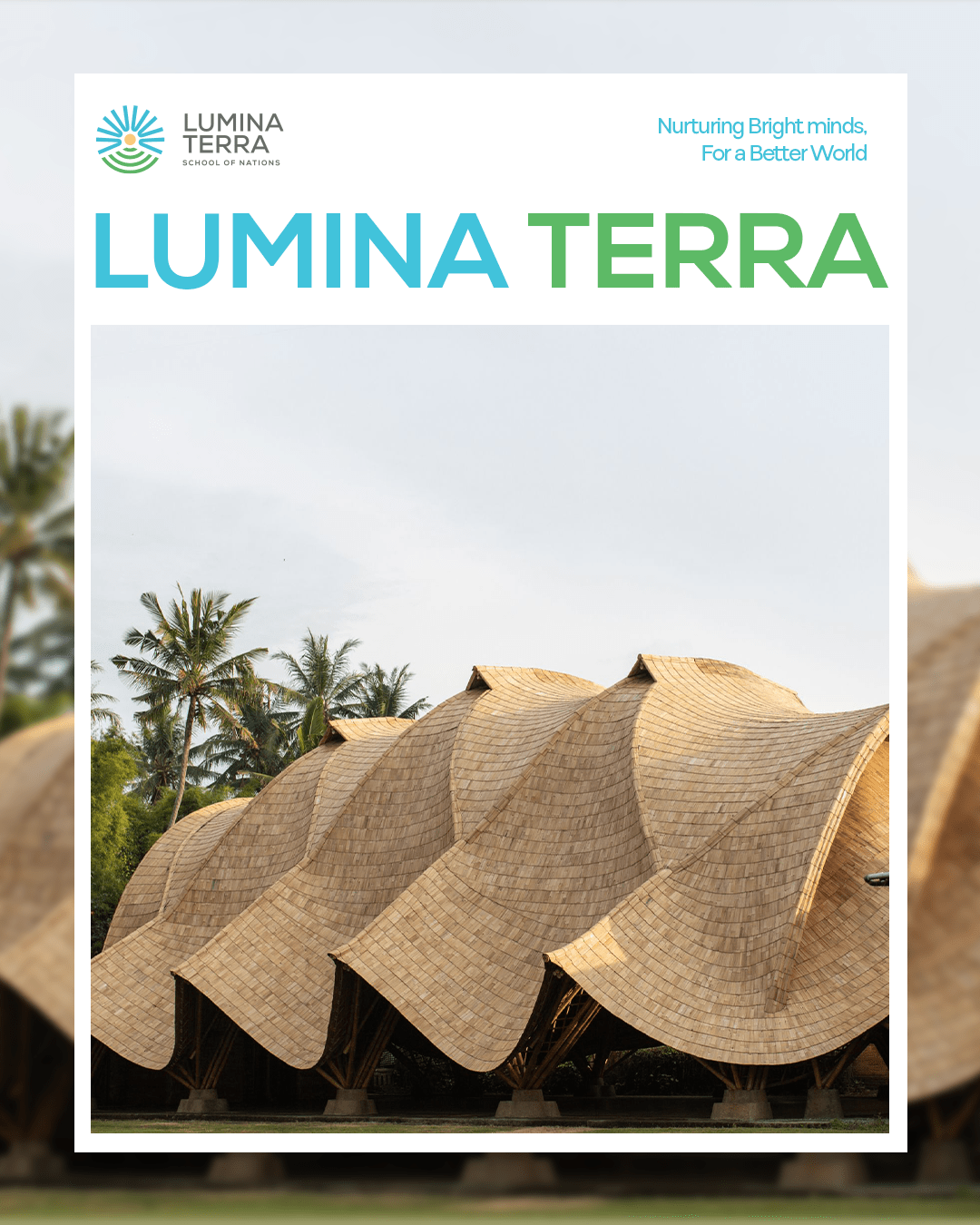
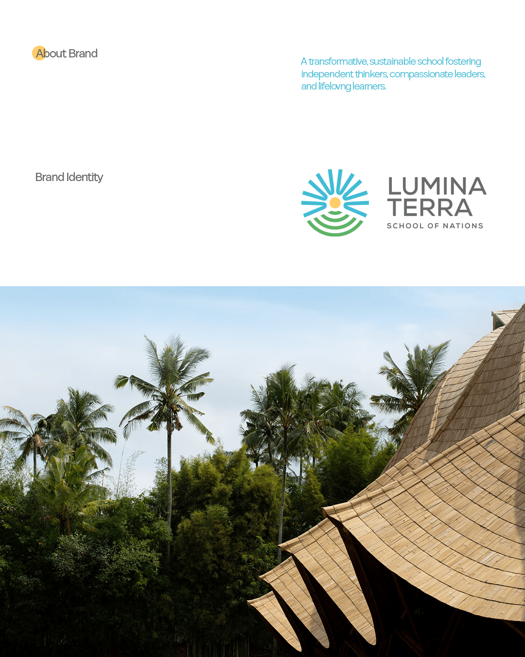
Lumina Terra
Brand Identity Design
Brand Guidelines
Brand Strategy
Communication Creative Design
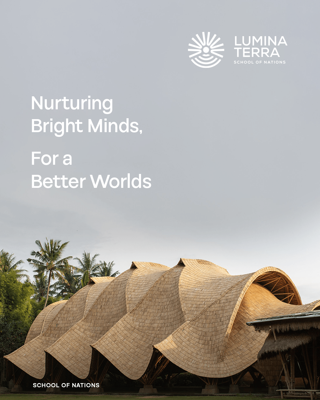
“Where Your Vision Meets the Light.”
A transformative, sustainable school fostering independent thinkers, compassionate leaders, and lifelong learners, To nurture both mind and spirit, creating a holistic, process-driven education that inspires curiosity, confidence, and climate consciousness. The Core Values of Collaboration, Character, Creativity, Critical Thinking, Curiosity, Compassion, Climate Consciousness, Community.
Every great journey begins with a spark of vision and ours began as FatFrog Branding & Design Studio, a bold, creative space where ideas leapt beyond limits. FatFrog Branding & Design Studio was where we celebrated imagination, broke the mold of traditional education branding, and dared to be different. We brought color, curiosity, and character to everything we touched. But as our mission grew deeper and more meaningful, so did our identity.
We weren’t just shaping a brand anymore we were shaping futures. We realized our purpose went far beyond creativity it was about enlightening minds, nurturing values, and cultivating global citizens. We needed a name that reflected the depth of our educational philosophy and the breadth of our vision. And so, Lumina Terra was born.
Rooted in Latin “Lumina” meaning light, and “Terra” meaning earth our new identity symbolizes everything we believe in: grounded learning, radiant thinking, and purposeful growth. From playful beginnings to purposeful transformation, our brand evolved to reflect the heart of what we do lighting up young minds and helping them grow in harmony with the world around them.
Lumina Terra
A transformative, sustainable school fostering independent thinkers, compassionate leaders, and lifelong learner.
Mission
To nurture both mind and spirit, creating a holistic, process-driven education that inspires curiosity, confidence, and climate consciousness.
Vision
A revolutionary learning model that blends academic excellence, personal growth, and environmental responsibility, shaping a more equitable and united world.
Lumina Terra’s brand strategy is to position itself as a transformative educational institution that blends traditional values with modern learning approaches to develop well-rounded, confident, and compassionate learners. Our goal is to create a strong emotional connection with parents, students, and the wider community by consistently delivering a nurturing and inspiring educational experience. Through a warm, trusted, and forward-thinking brand voice, Lumina Terra emphasizes curiosity-driven learning, innovation, and integrity at every touchpoint. We aim to differentiate Lumina Terra by focusing on holistic education, child-centered teaching methods, and meaningful community involvement, ultimately building a brand that not only educates but also empowers children to shine in every area of life.
Key Challenge
One of the core challenges faced by Lumina Terra is creating a differentiated educational experience in an increasingly competitive and standardized learning environment. As many institutions focus primarily on academic results, Lumina Terra seeks to balance intellectual rigor with emotional intelligence, creativity, and character development a vision that often requires shifting deeply ingrained expectations among parents and communities. Communicating this holistic, future-ready approach to education while maintaining trust and credibility is a strategic challenge. Additionally, establishing consistent brand identity and visibility across both digital and physical touchpoints from classroom culture to social media presence requires thoughtful alignment. Overcoming these challenges is essential for Lumina Terra to be recognized not just as a school, but as a movement shaping the next generation of compassionate, confident, and curious learners.
Identity Concept
“Lighting Young Minds, Enriching the Earth”
Lumina Terra is more than just a school it's a vibrant learning ecosystem where curiosity is nurtured.
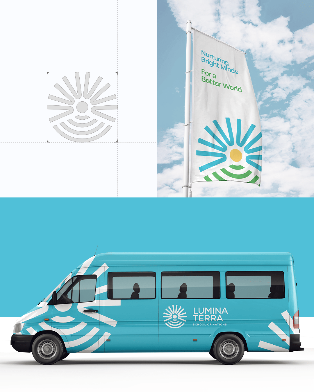
Embodiment of Enlightenment, Sustainability
The Lumina Terra logo is a visual embodiment of enlightenment, sustainability, and joy in learning.
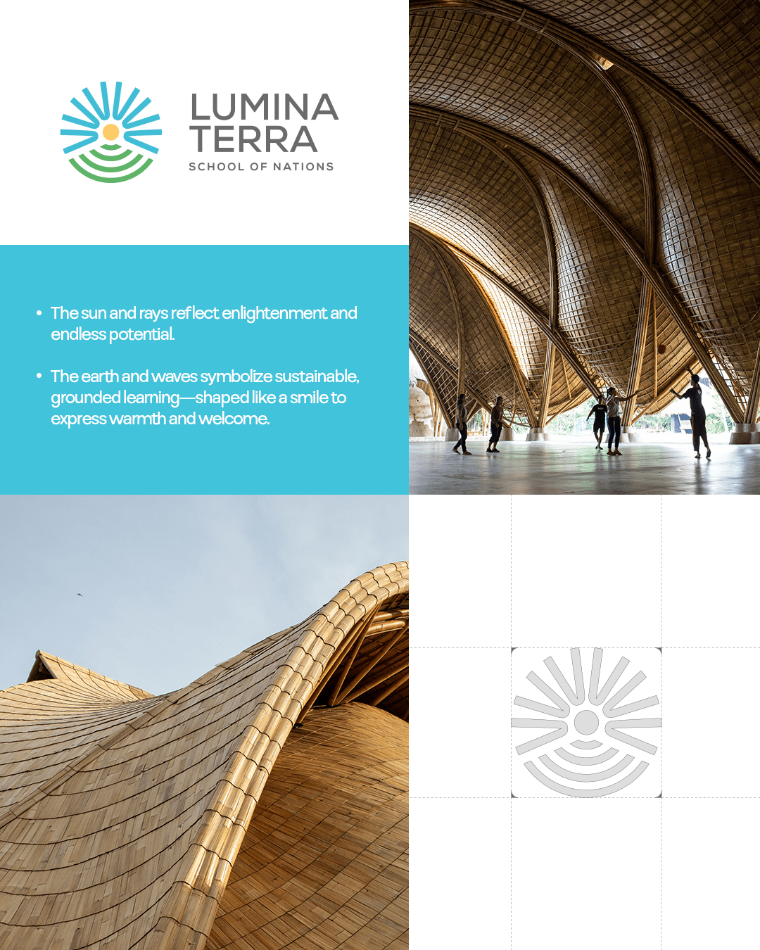
Sun & Rays (Blue & Yellow)
Represent enlightenment and limitless possibilities, merging as a guiding light for young minds.
Earth & Waves (Green)
Depict sustainability and grounded education. The curved design subtly forms a smile, reinforcing a welcoming,
Typeface Usage
For Lumina Terra’s brand identity, we have chosen Nexa as the
primary typeface. Nexa is a modern, clean, and highly legible sans-serif font that aligns with our brand’s values of clarity, innovation, and forward-thinking education.
Hierarchy & Readability
Headlines should be distinct and engaging, set in Mosvita Bold or Semi-Bold.
Subheadings should guide the reader through content while maintaining visual harmony.
Body text should be clear and easy to read, using Mosvita Regular or Light.
Emphasis should be added using weight variations (Bold, Italic) instead of excessive styling.
Font Style....
MOSVITA
abcdefghijklmno pqrstuvwxyz
ABCDEFGHIJKLMNO PQRSTUVWXYZ
1234567890! @#$%^^&*()
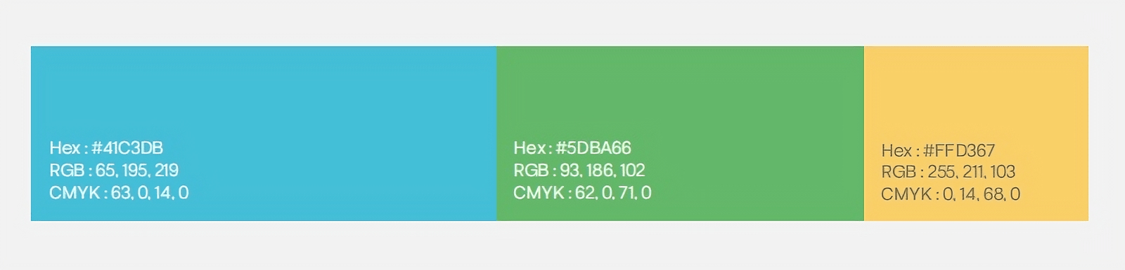
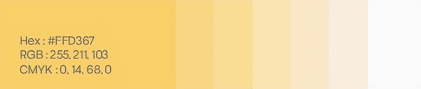
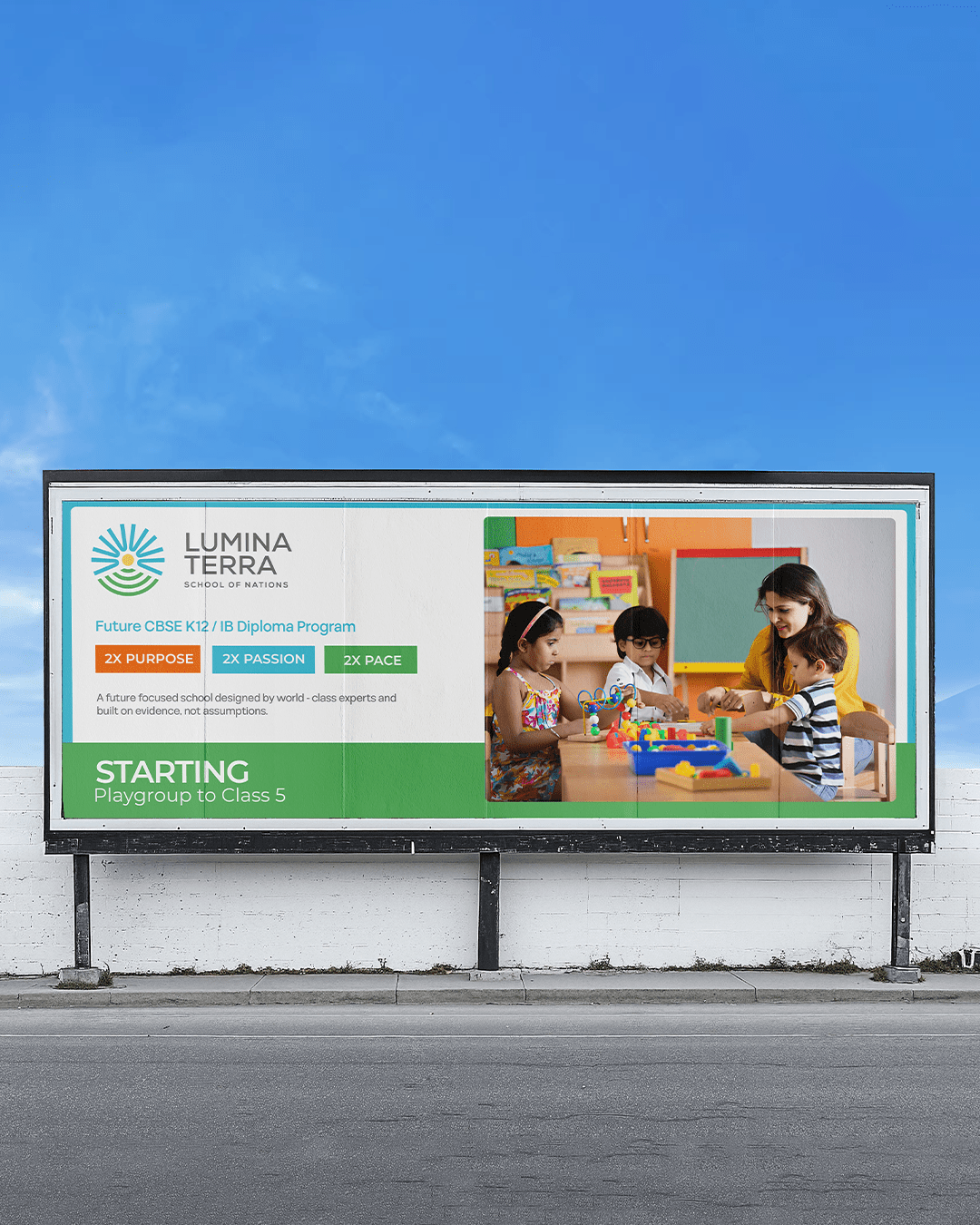
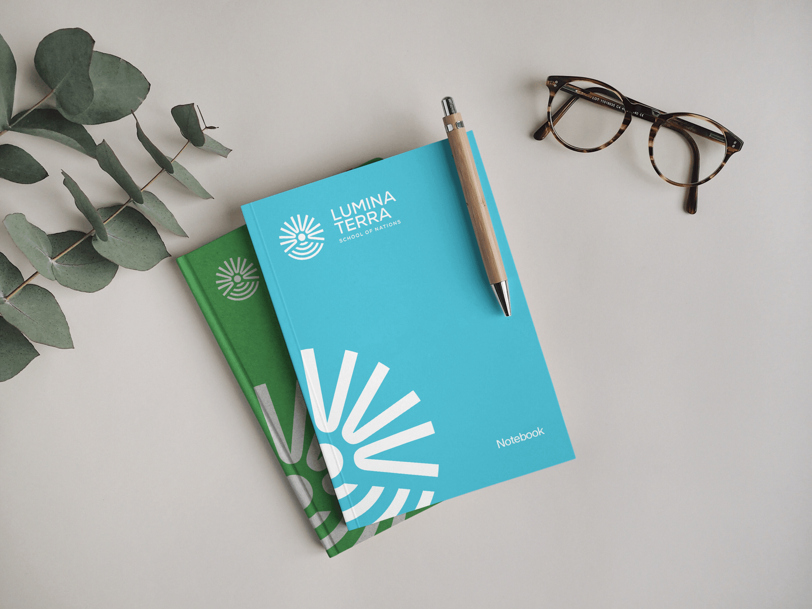
Use of Colour Palette
Lumina Terra’s color palette is designed to embody its core principles of sustainability, enlightenment, and personalized learning. The selected hues create a visual identity that is both vibrant and harmonious, reinforcing the brand’s commitment to fostering growth, knowledge, and environmental consciousness.
Primary Color Dominance
Lumina Blue (#2BA6DE) should be the dominant color across all brand communications.
It should be used for backgrounds, key design elements, call-to-action buttons, and highlights in both digital and print materials.
Ensure blue is the most visible color to reinforce brand recognition.
Accent Colors for Balance
Sun Yellow (#FFC83D) should be used sparingly to highlight important elements, add warmth, and evoke positivity.
Earth Green (#4CAF50) should complement blue in designs related to sustainability, nature, and well-being.
These colors should never overpower blue but rather enhance its impact.
Creative Direction
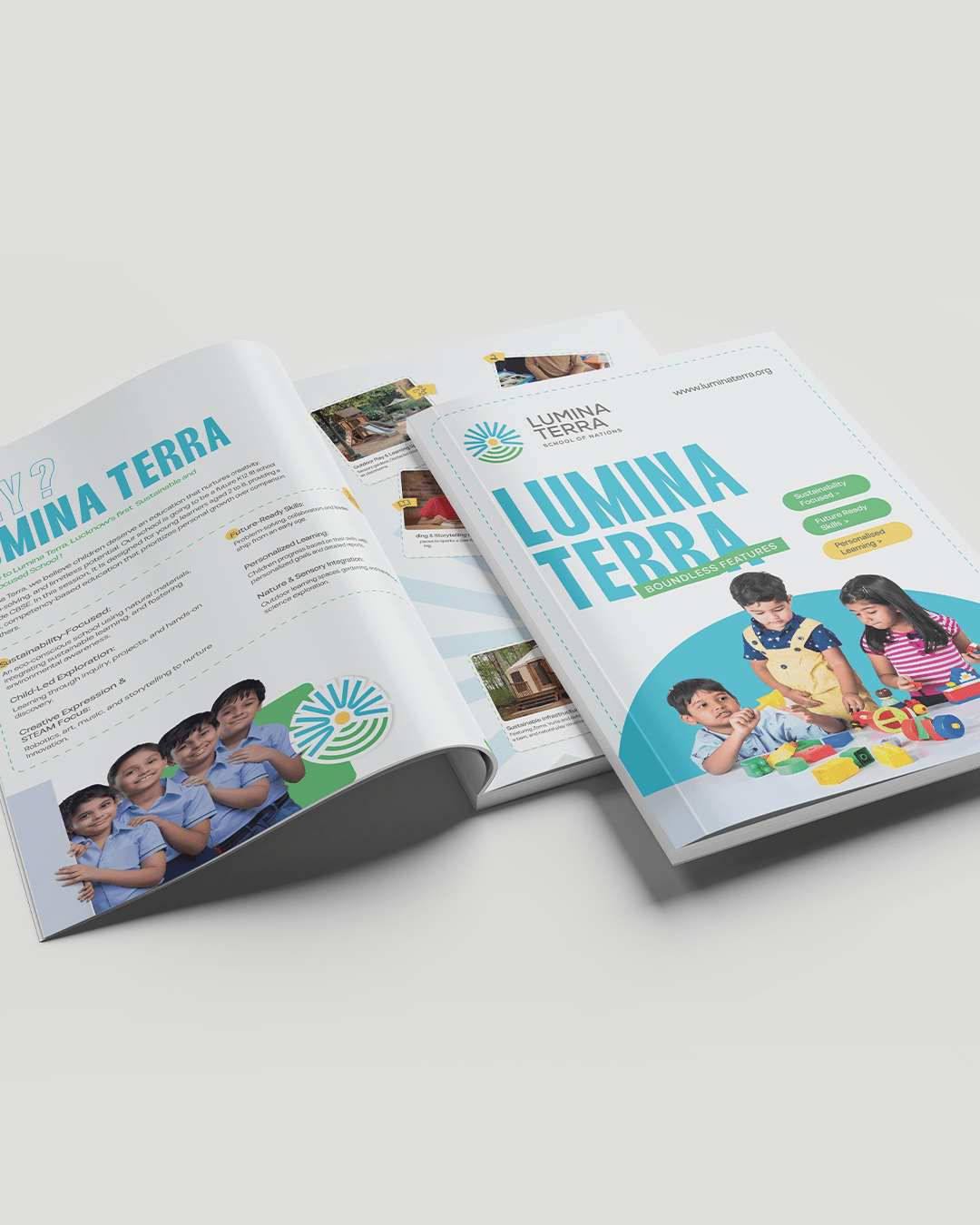
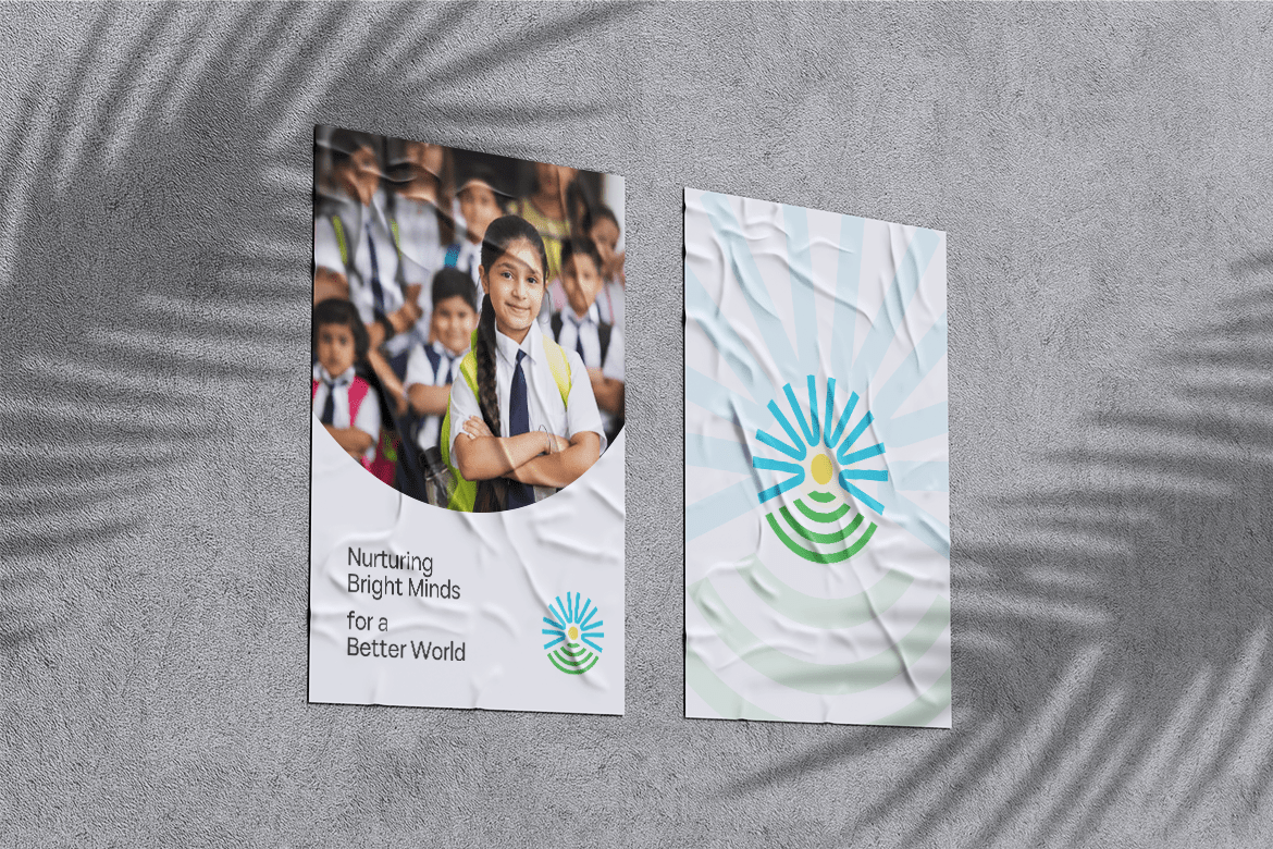
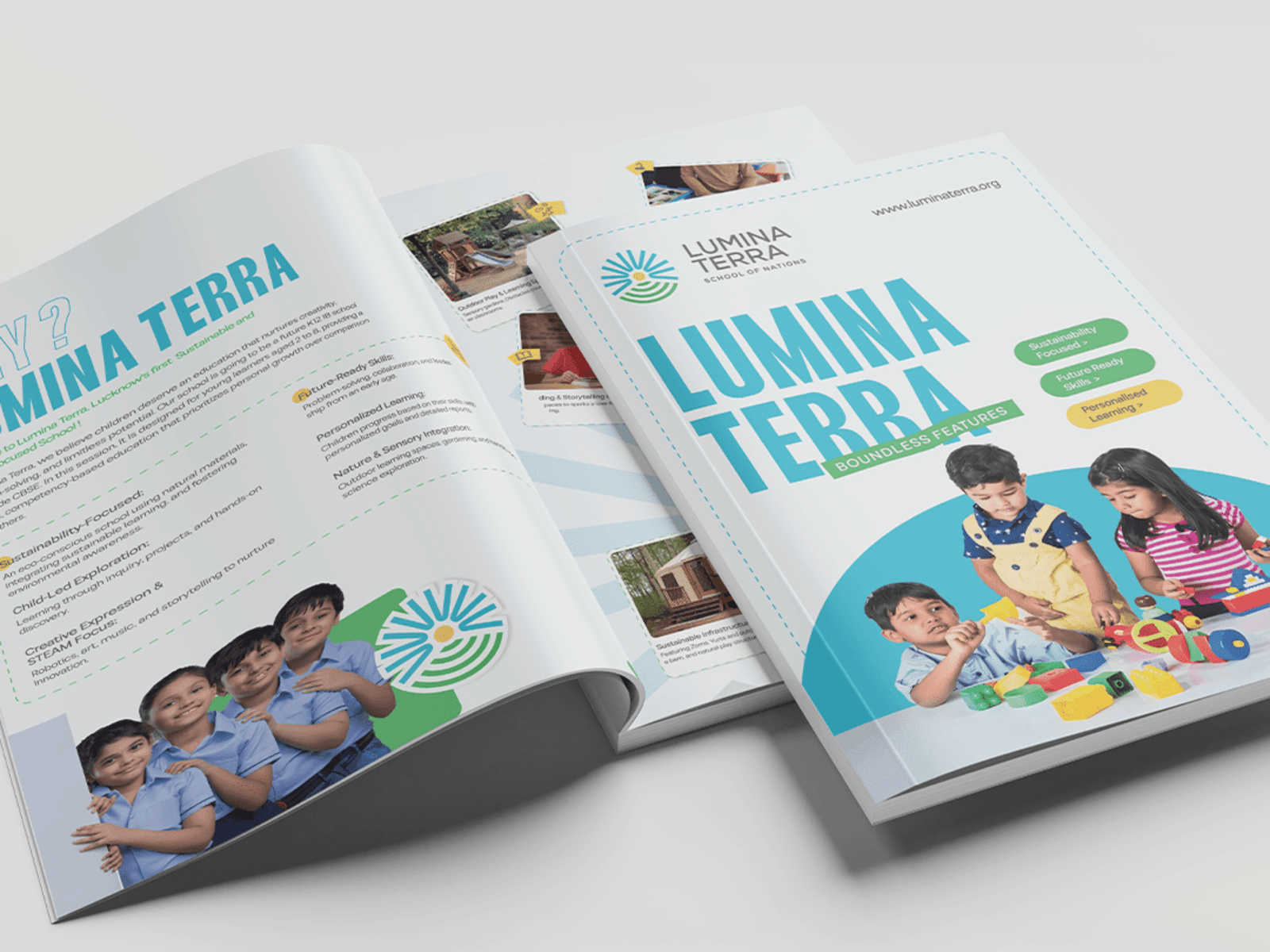
The creative direction for Lumina Terra centers on illuminating the journey of learning through a blend of warmth, elegance, and imagination. Visually, the brand will draw inspiration from nature and light soft earthy tones paired with Green, Yellow and Blue highlights to represent growth, grounding, and enlightenment. Typography will balance tradition and modernity, using a Mosvita font to convey trust and legacy, paired with clean sans-serif elements for clarity and innovation. Imagery will feature candid, emotive moments of children learning, exploring, and connecting capturing curiosity, joy, and discovery in natural lighting and authentic settings. The tone of voice across all content will be nurturing, empowering, and thoughtful speaking to both the hearts of parents and the aspirations of young learners. Symbolism such as trees, stars, paths, and light beams will subtly reinforce the idea of rooted learning and bright futures. Lumina Terra’s creative identity will not only reflect an educational institution, but a sanctuary of potential where every child is guided to grow brightly and live bravely.
LUMINA TERRA
Schools of Nation
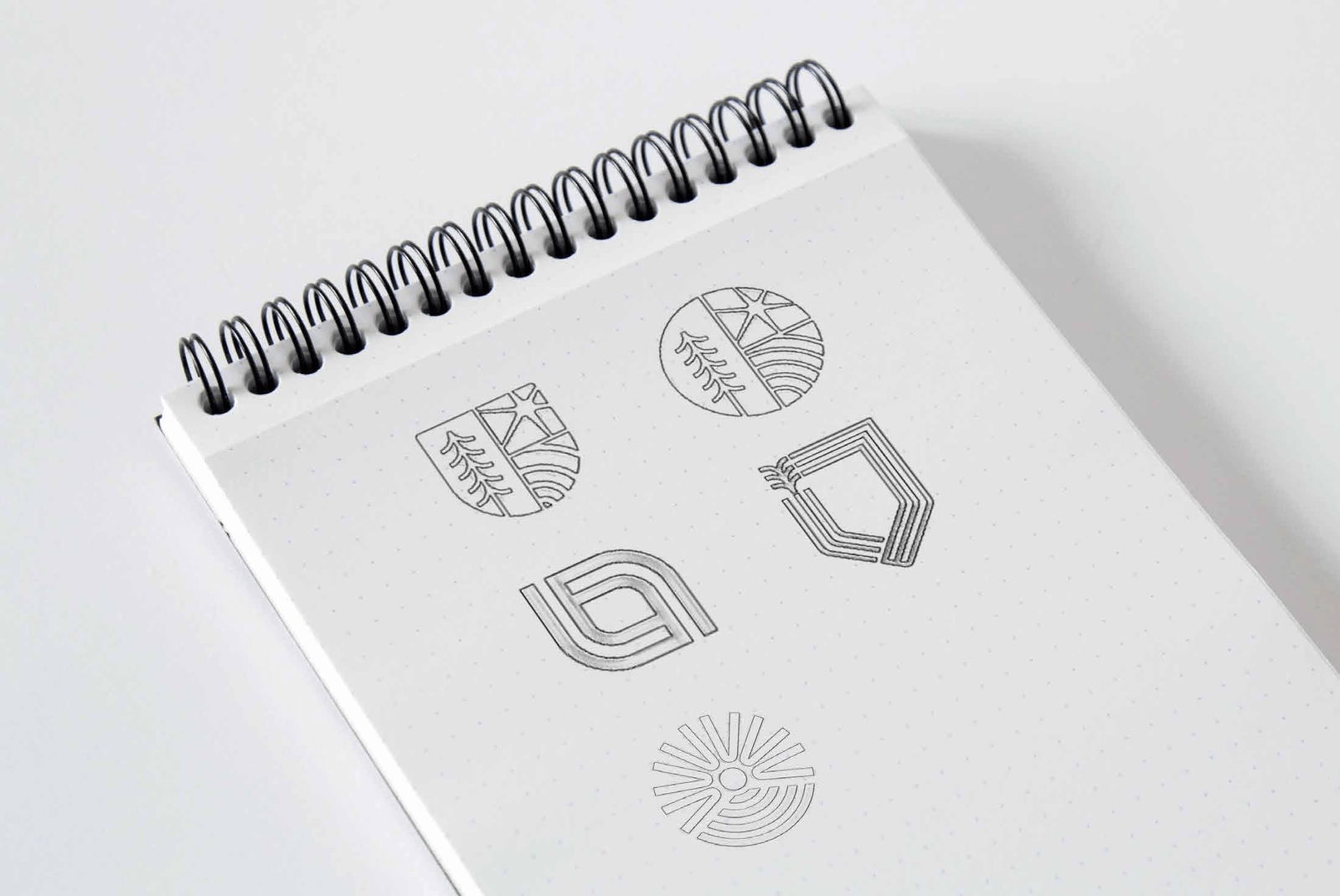
Sketching
Core Visual Elements to Explore in Sketches
A progressive, nurturing educational space that combines the brilliance of knowledge (Lumina) with the grounding strength of values and nature (Terra). The visual identity should reflect light, growth, wisdom, and balance.
Sun + Earth Fusion
A radiant sun gently rising over a curved earth or book.
Rays of light that subtly resemble pages, growth rings, or learning paths.
Earthy textures like leaves, roots, or soft soil lines integrated with circular sun rays
Usage on Social Media
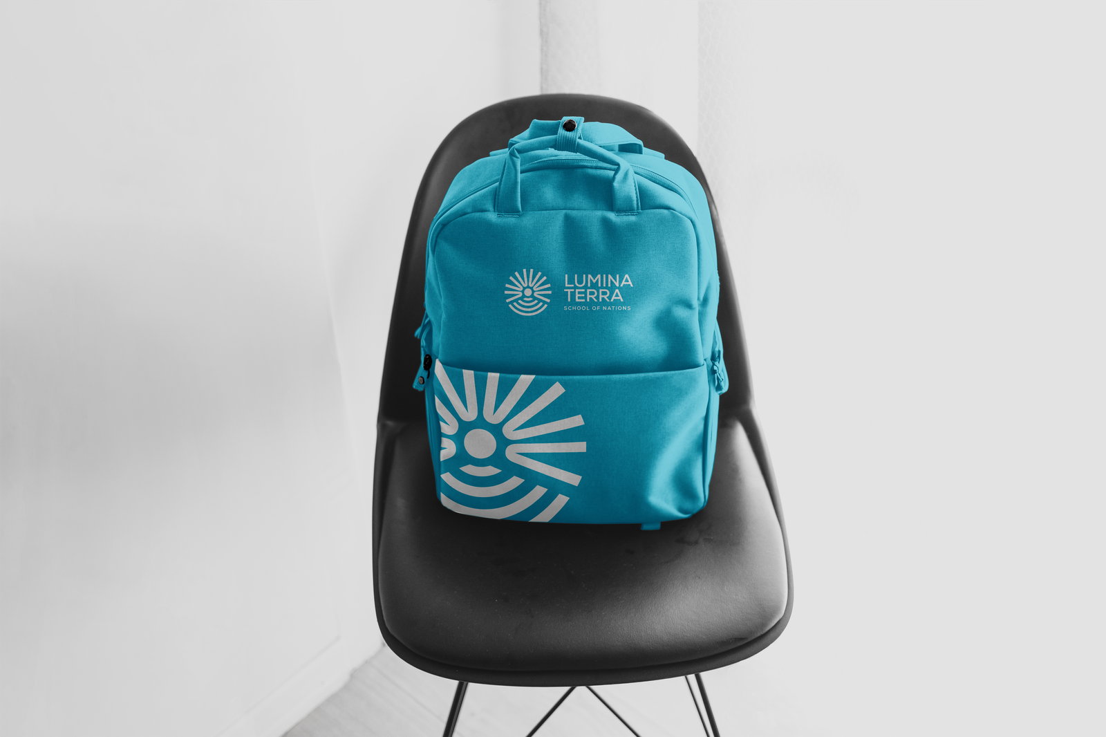
Adapt the logo and brand elements for various social media platforms while ensuring consistency.
Place the logo on a solid or minimal background for better legibility.
Use a simplified or icon-based version of the logo for profile pictures.
Ensure visuals align with platform-specific dimensions without compromising brand integrity.